Roles:
Collaborators:
Platforms:
Lead level designer
Chief Creative Officer, Art Director, 3D & Environment Artists
Unreal Engine 4/5, Blender, Substance Painter, Photoshop, Steam VR
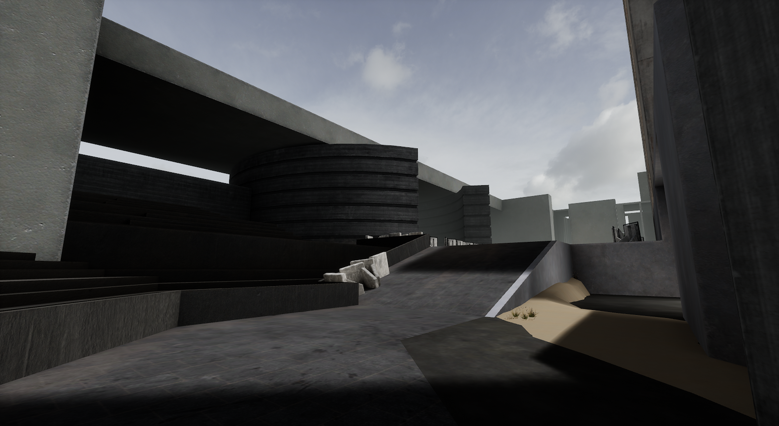
Level Design: ctf arena
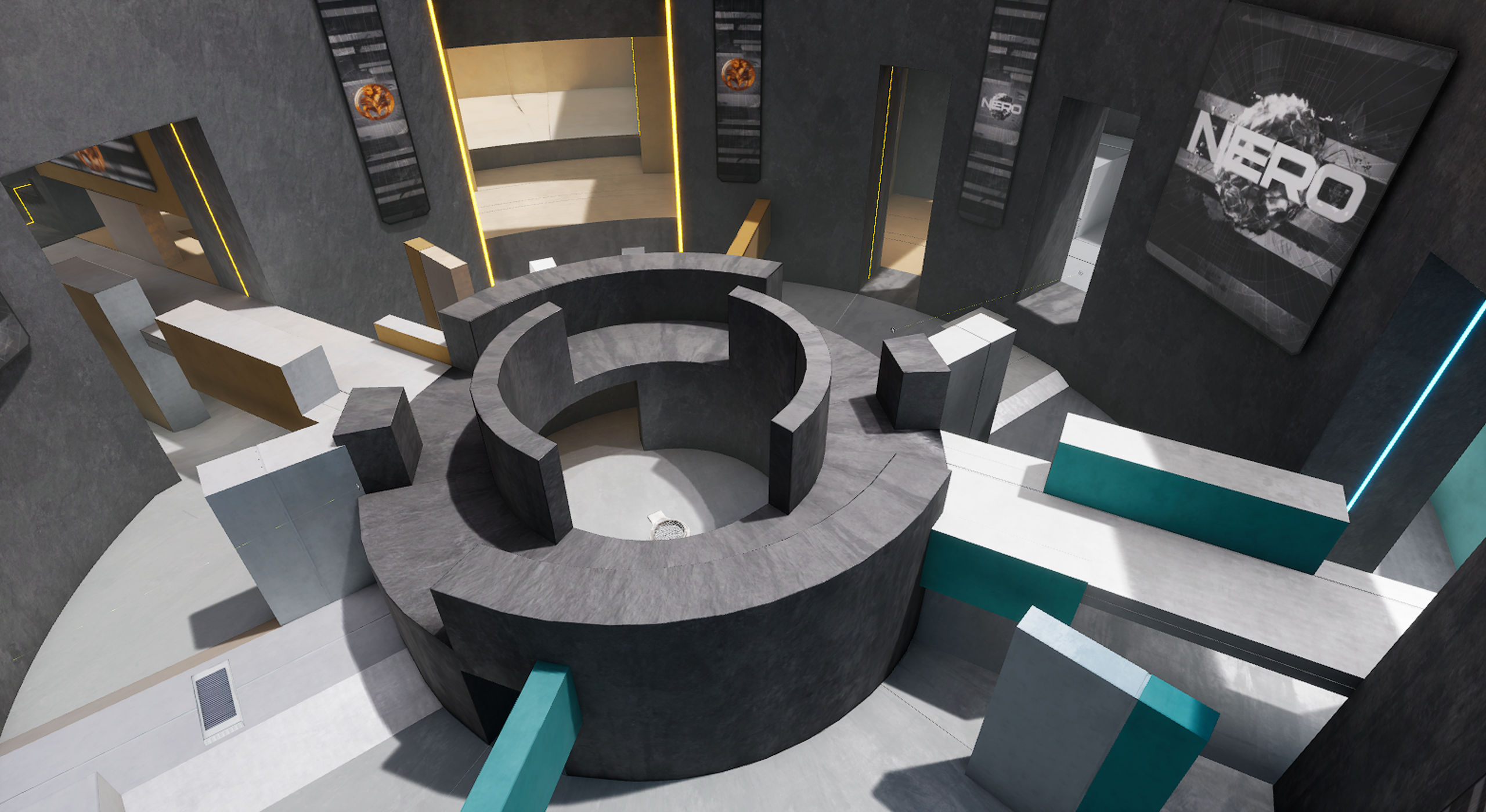
The CTF Arena level (named “Nine”) was a new level that shipped with VAIL’s early access launch on November 16th 2022. I authored the initial 3D concept, organized playtests with competitive players from our Discord community, authored the subsequent 3D iterations, and directed the final aesthetic concept and art pass. The level was developed from early October until the early access launch, with a few subsequent balance updates in the weeks following.
For the early access launch, Nine’s primary objective was to be a showcase for our new Capture the Flag game mode (called Capture the Orb). The game mode and map were targeted towards the casual player audience that would be joining our player base upon release. In anticipation of this, I set several other objectives for the level’s design that I thought would lead to a successful reception. First, given our target audience, I wanted to make the level easy to navigate and quick to engage so players didn’t feel lost trying to find the enemy. This meant all routes needed to flow back towards the areas of interest (no dead-ends) and all zones of the level should remain active (no disconnected areas and a small overall map footprint). Second, we were also preparing a subsequent release of our Free-For-All game mode in December. I wanted Nine to be a comfortable choice for all three casual game modes to make the level more extensible (Team Deathmatch, Capture the Orb, Free-For-All). To accommodate the FFA game mode, Nine’s design would have to avoid a typical 2-base style map. Finally, given the short development and production timeframe (5 weeks total), I wanted to ensure the level was designed in a way that made large, structural balance changes easy to iterate and ensured the final art pass could be done quickly on top of the graybox prototype.
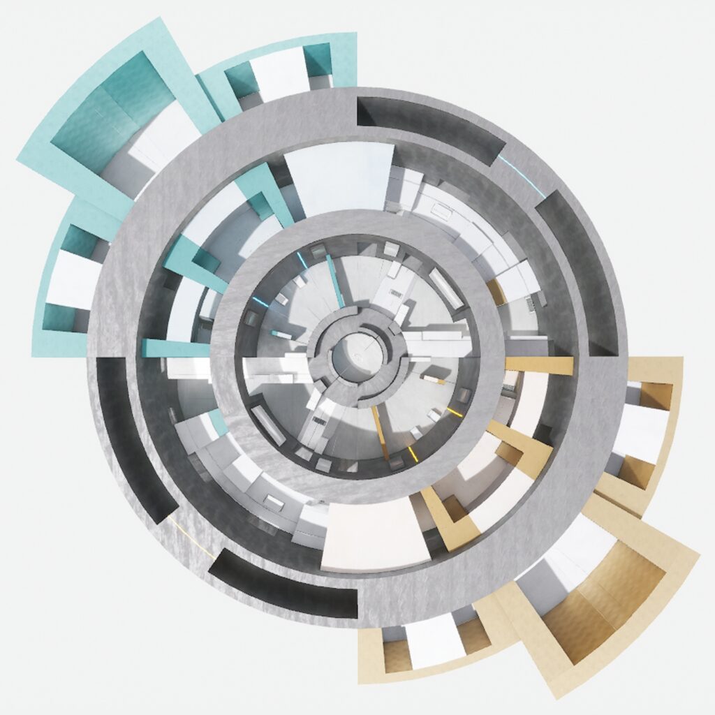
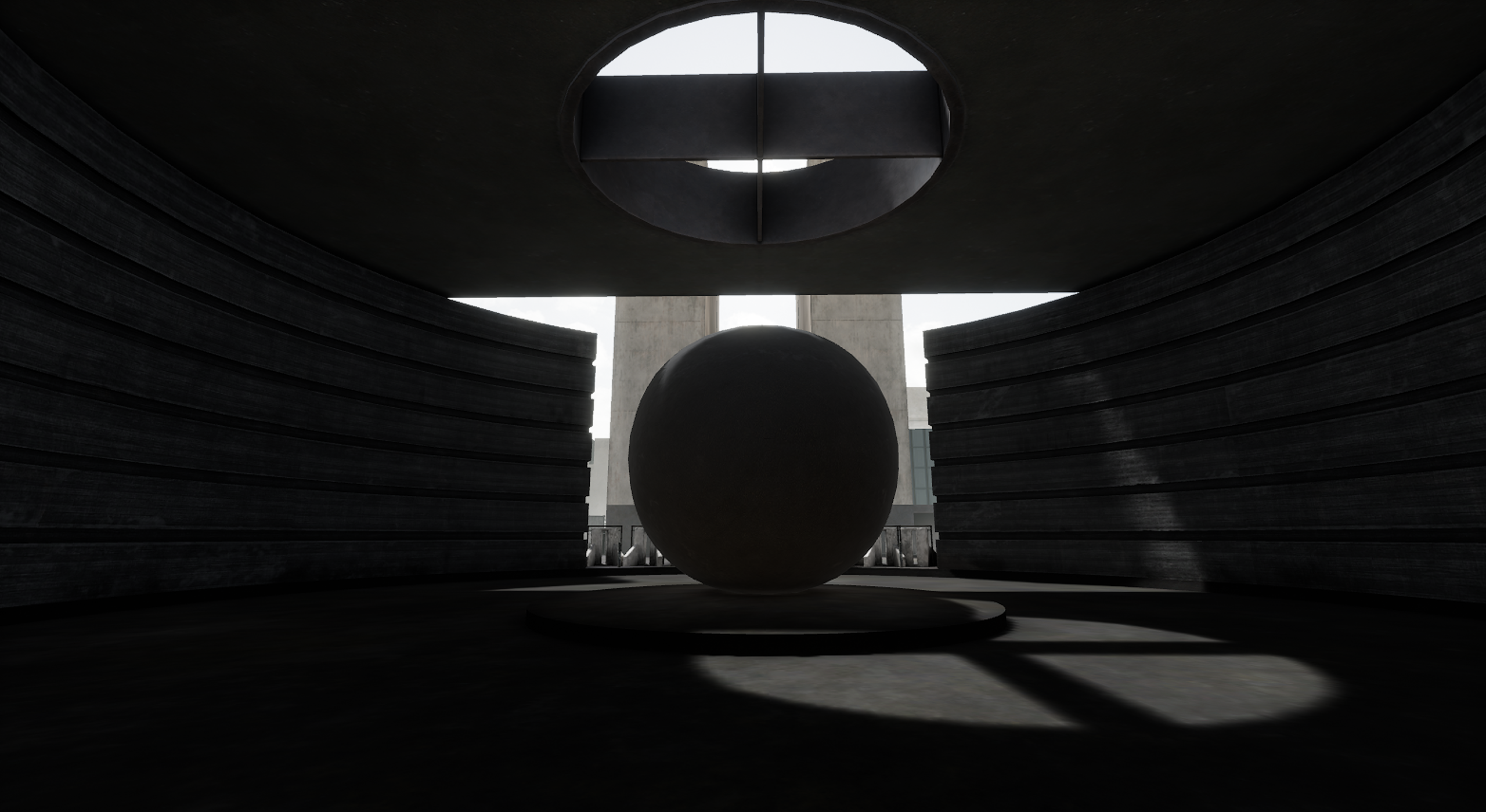
I started with a circle as the level’s extents which would naturally guide the player around the arena and avoid any corners or dead end spaces. I also thought this primitive shape was aesthetically relatable with other modern arenas. Within the extents of the circle, I wanted to explore an overlapping figure-8. This continuous path would provide at least 2 routes on each side of the map that would funnel players towards the center. In this way, the center would become an important position to hold and would become a locus for the gameplay action, similar in nature to Halo 2’s Sanctuary level.
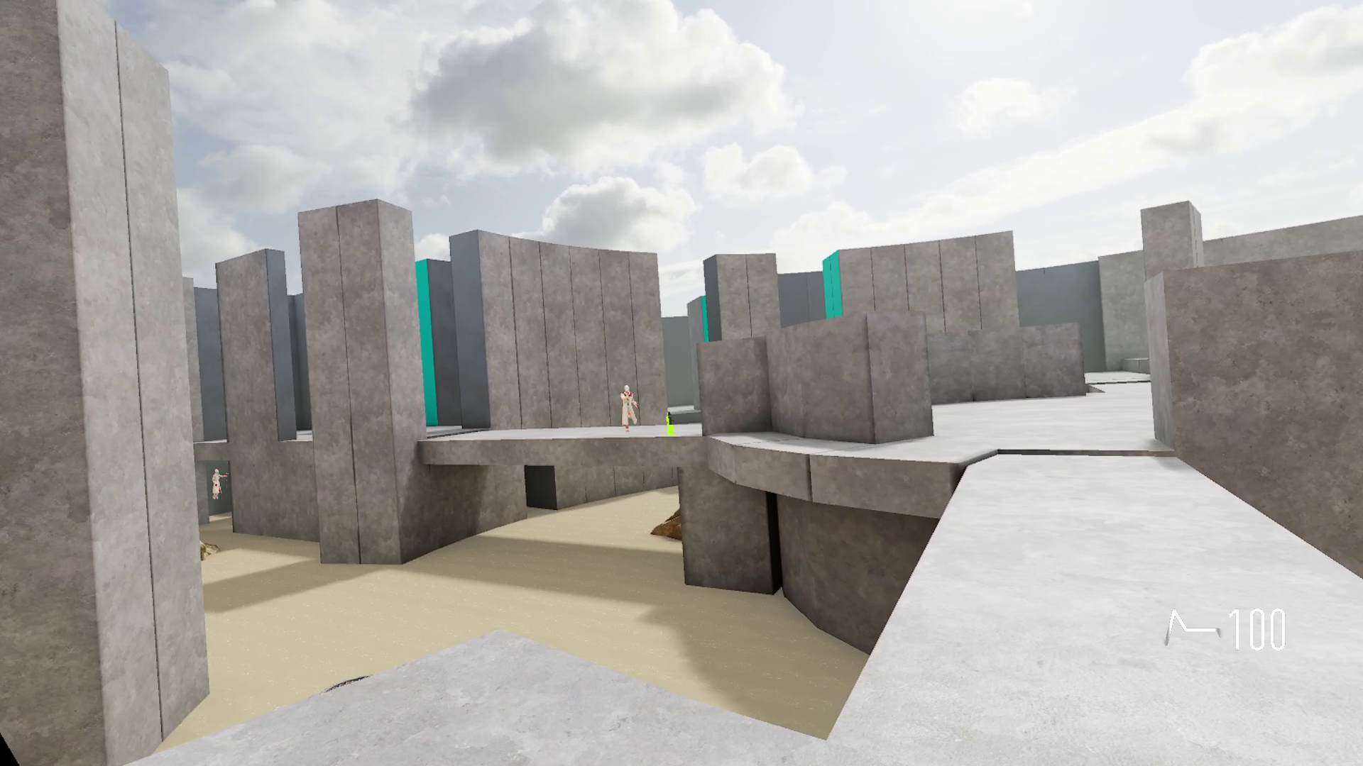
Initial tests on version 1 proved the figure-8 concept worked well for player comprehension and created an interesting tension between the high and low routes. When testing with a full 5v5 game though it became obvious the map was not big enough and did not provide enough route options for each team. Teams were forced to send multiple players at a time down the same routes which did not provide meaningful options for supporting each other from different angles.
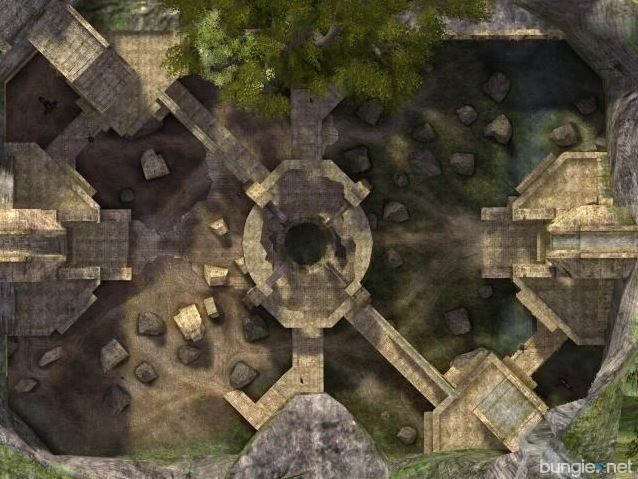
I looked to Halo 2’s Sanctuary map as a strong reference for the redesign. Similar to Nine, Sanctuary features two bases where the available routes led through or around the center across two different over/under elevations. What was especially interesting about Sanctuary’s center structure was how the center zone could be both an asset or a liability to a team, depending on how they used it. If a team captured the center and utilized the outward angles they could use it to suppress the enemy team and push into their base. If a team occupying the center became too defensive and lost control of the adjacent perimeter spaces however, it presented an opportunity for the opposing team to quickly flank and surround them. I used this design as a reference but made one other key change: I offset the lanes leading into the center and thus blocked the line of sight from base-to-base. This meant that if a team wanted to control the center, they would have to physically occupy it and fight within the center structure itself which made the engagement more dynamic.
After several additional rounds of playtesting, the final version of the map remedied the remaining issues. The most obvious problem was that the two perimeter zones were too exposed due to the lack of cover. Initially I had wanted teams to fight at long distance from base-to-base to control these zones, but the playtest results showed that it was presenting too many angles for players to cover if they hoped to cross in the open. The risk wasn’t worth the effort and players defaulted to fighting through the center structure exclusively. I knew that adding more cover pieces in the open area wouldn’t be an appropriate solution since each piece of cover can also be a threat if an enemy is hiding behind it, so it wouldn’t solve the underlying issue of risk. Instead, I opted to close off more of the sight lines by constructing a series of perimeter walls. The perimeter walls worked well with the arena’s aesthetic concept and effectively partitioned the map into 5 distinct lanes: the center structure, the inner ring, and the outer ring.
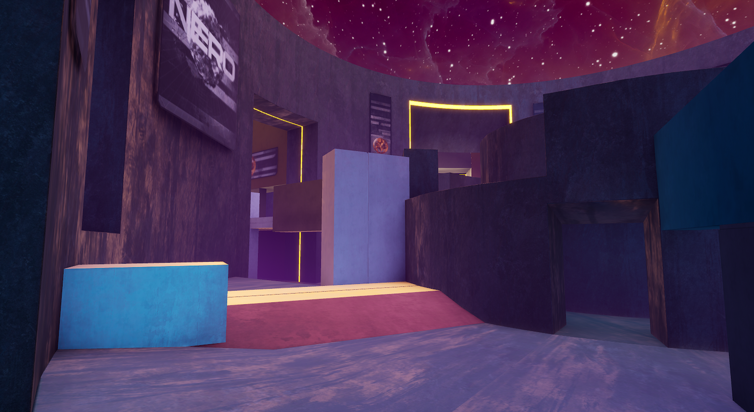
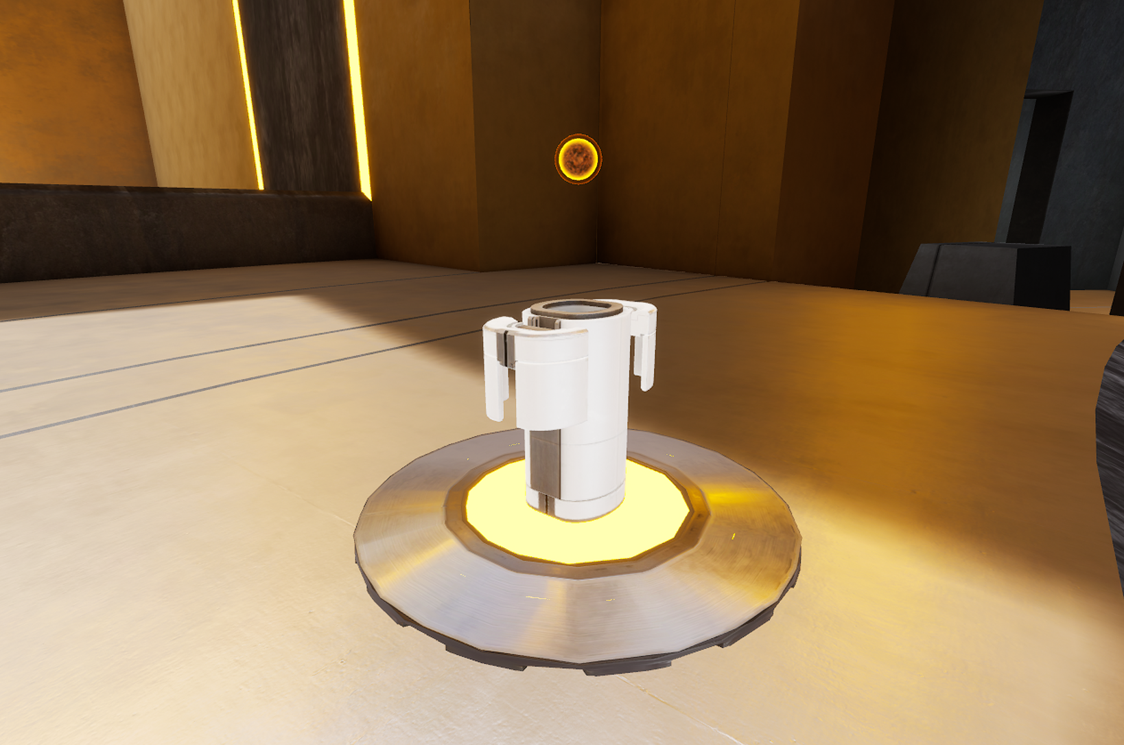
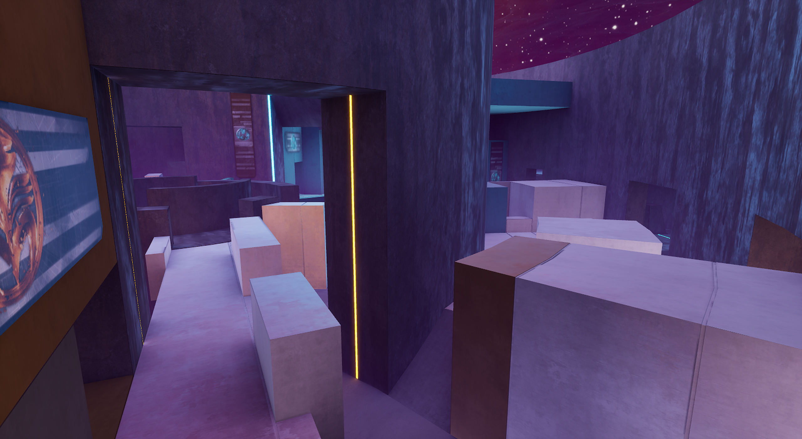
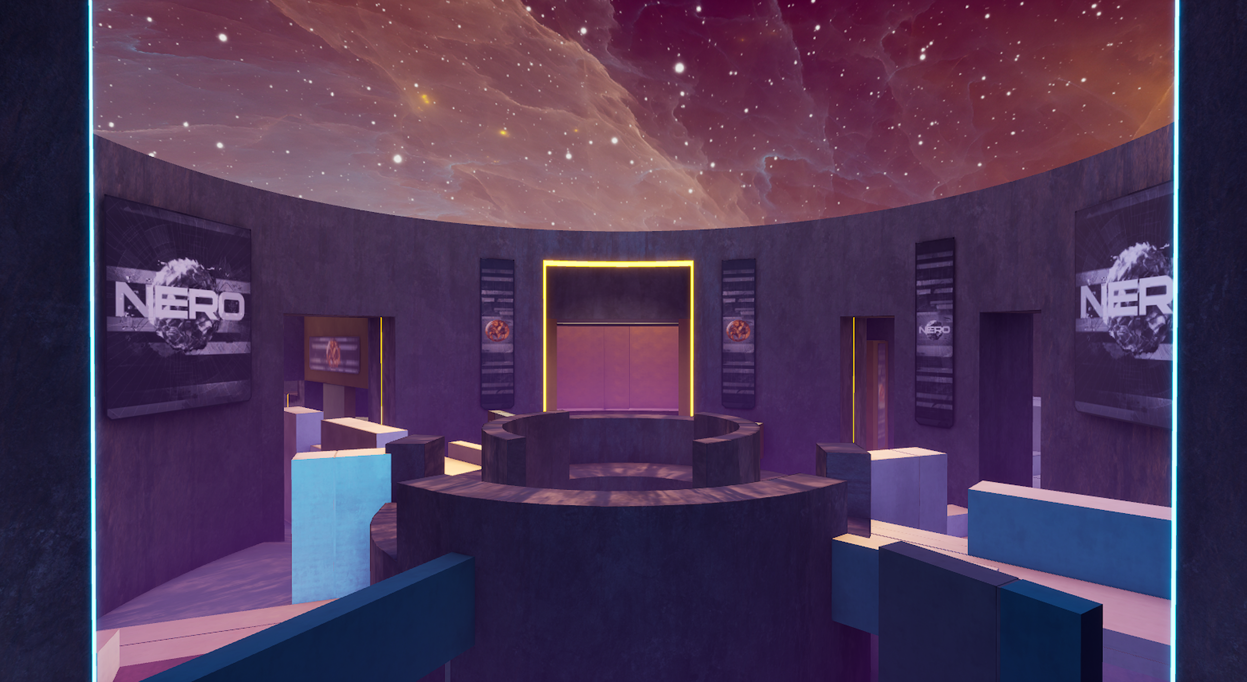
The level’s aesthetic concept was derived from the limited development time: we only had 5 weeks total before early access launch to complete the map layout and art, start to finish. Working with our Art Director and Chief Creative Officer as well as our Concept Artists, I developed a visual language to unify our upcoming arena maps (we planned to subsequently release one or two more). I chose to pursue monolithic, seamless materials that would both evoke the excitement and danger of a combat arena and also be relatively easy to layer on top of our graybox level geometry with minimal UV and detailing work. I wanted to afford us as much time as possible to refine the map layout as I knew making structural balance changes after the art pass would be wasteful. In the end, I settled on a 3-piece material palette and envisioned the arena as a somewhat surreal and alien structure: a monolithic black stone for the massive perimeter walls, a futuristic bright metal as a base ‘canvas’, and anodized colored metal for each team’s respective base. The final geometry and materials were produced by our two environment artists over only 3 days, just before launch. The final arena graphics harmonized well with VAIL’s clean, minimalist aesthetic and the map was used to stage our early access launch trailer.
Environment Design: Este
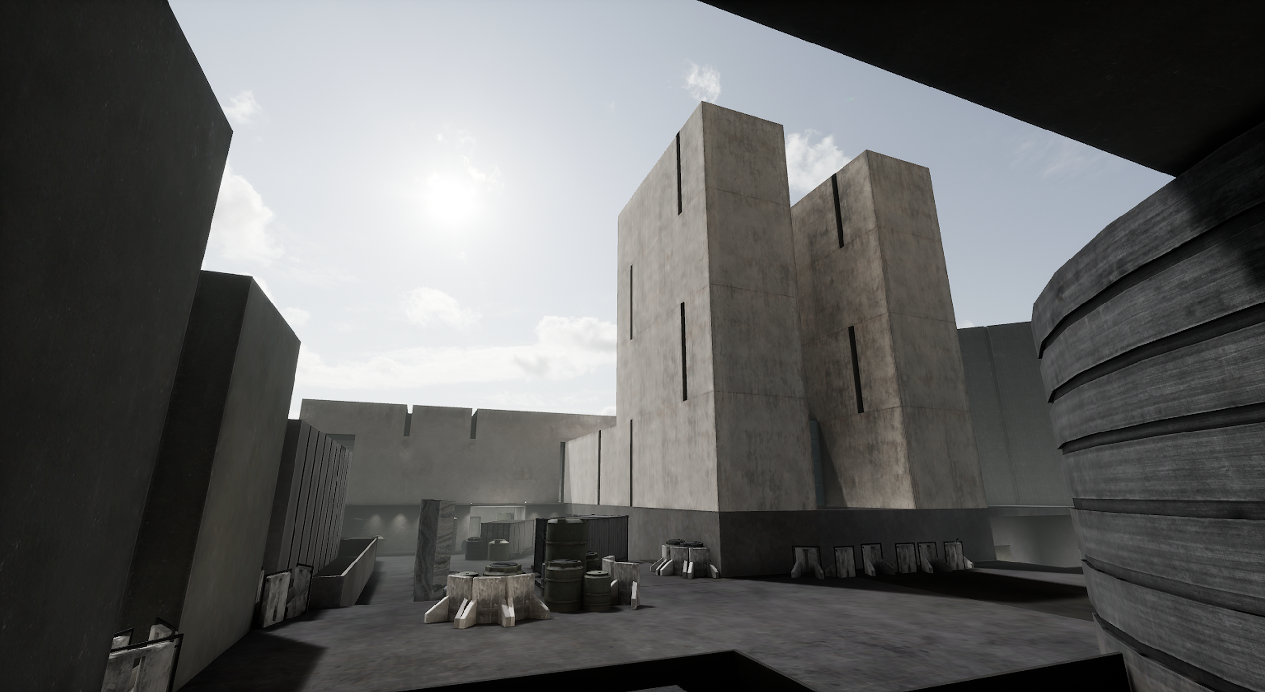
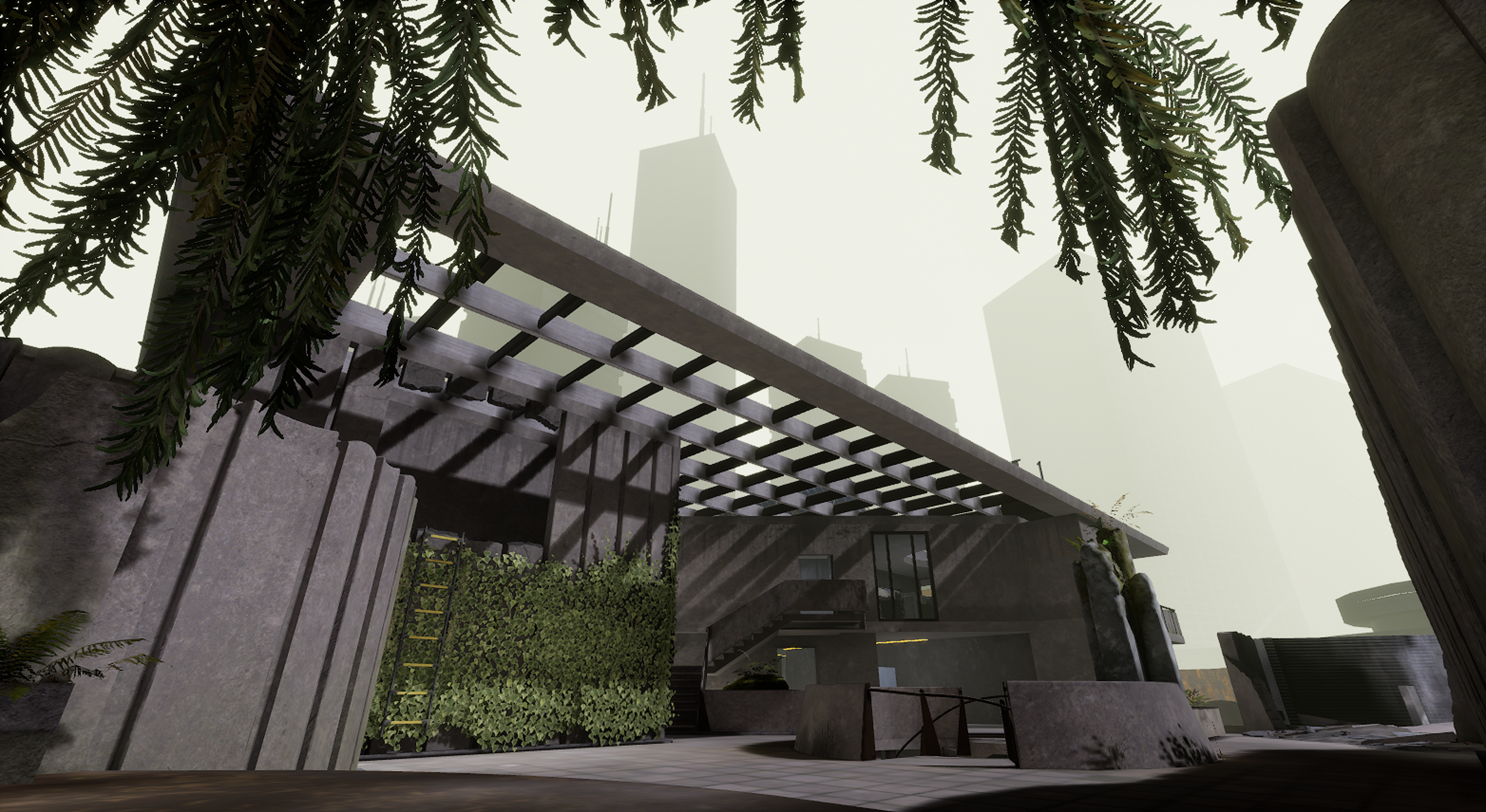
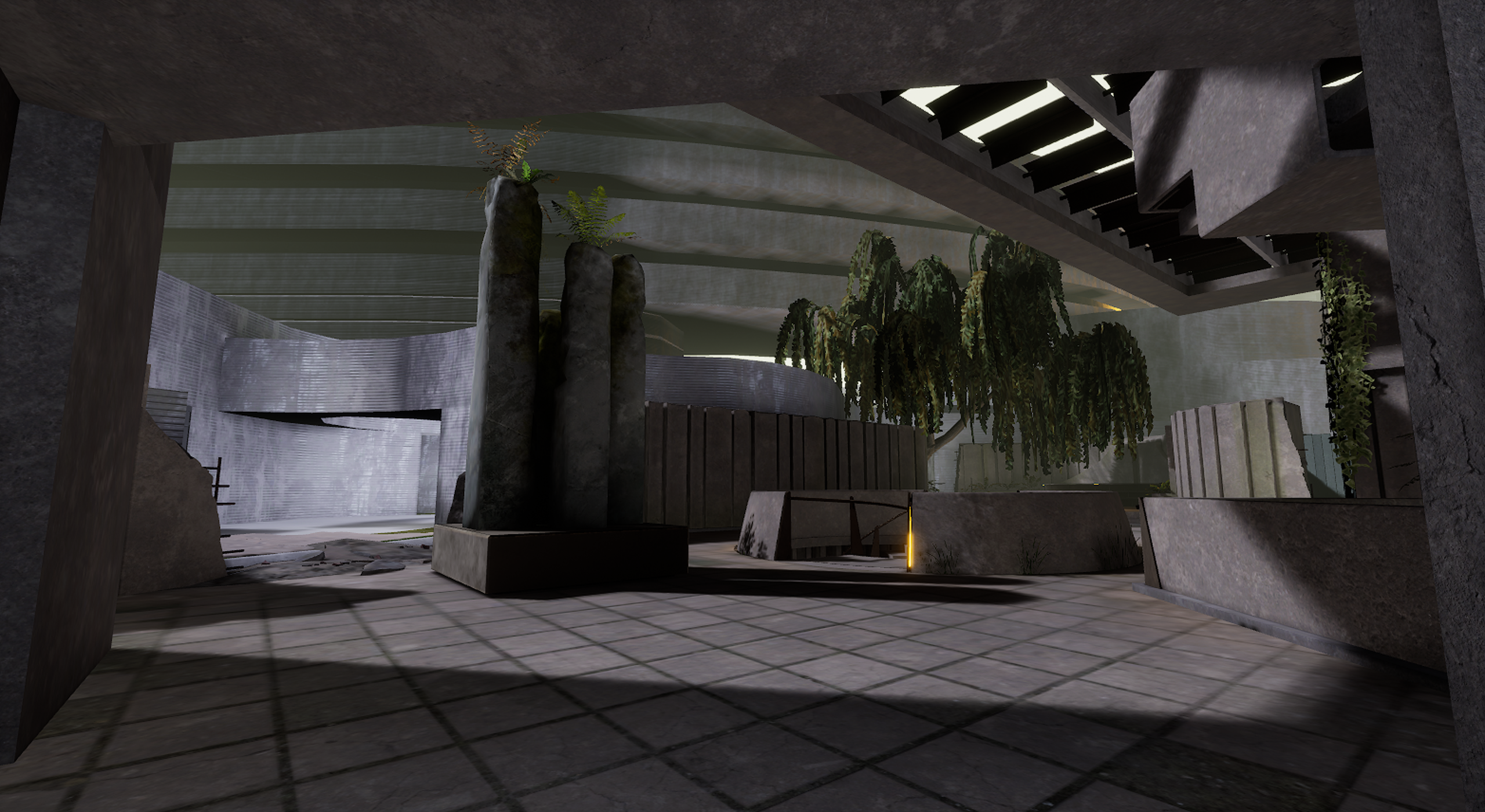
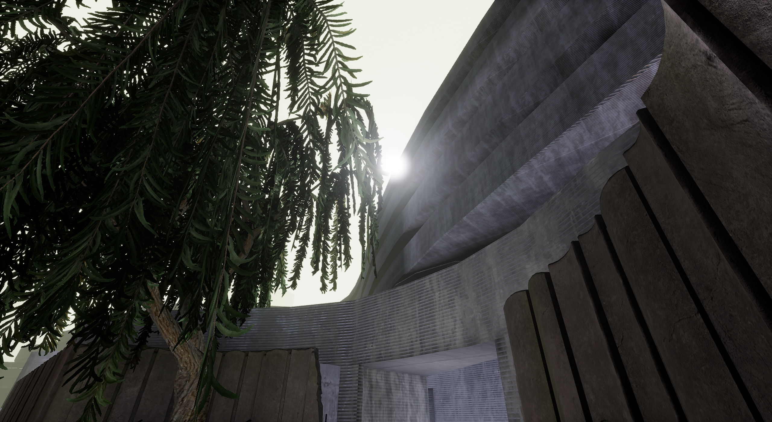
Este was one of the last levels in our development roadmap. When I joined AEXLab, the playable space had already received its final art pass, but the perimeter spaces and surrounding environment were still in a rough graybox level of detail. My objective was to finish developing the level’s boundary art to make the level feature complete.
I started by thinking about the lighting and atmosphere and how these could be improved to set the tone of the level’s aesthetic concept. The overwhelming gray of the architecture and the pre-existing colorless atmosphere imbued the level with a feeling of lifelessness. I thought the gray concrete and the building’s overhanging structure could appear more dramatic if the environment had a story. The level’s lore dictated it was located in southeast Asia, and I thought about the torrential monsoon season endemic to this part of the world. Stormy atmospheres–with their heavy clouds and ominous, surreal lighting–inspire a sense of impending danger, and I thought this feeling of dread could work well with the close-quarters, fast-paced combat of the map’s layout.
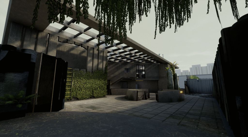
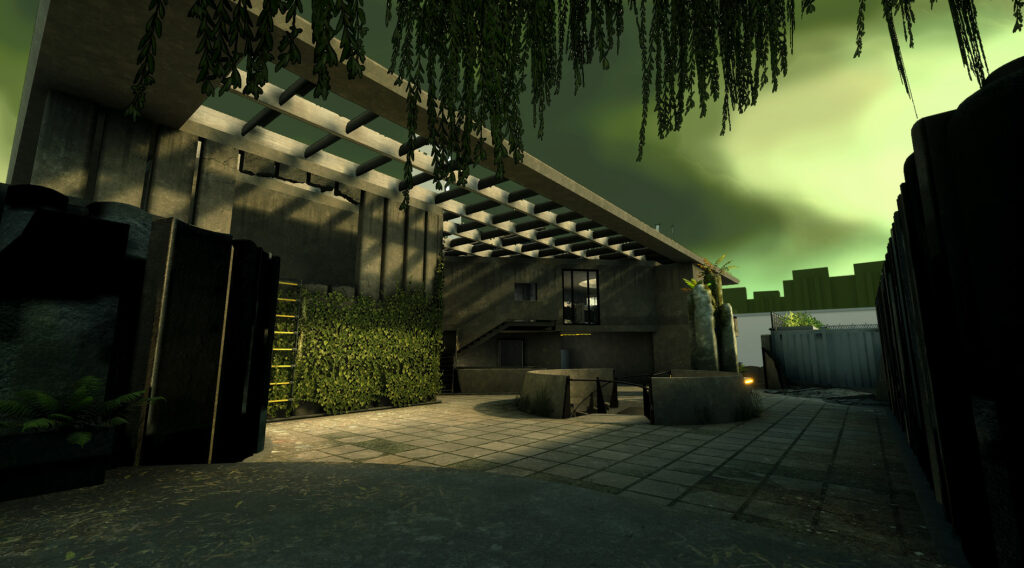
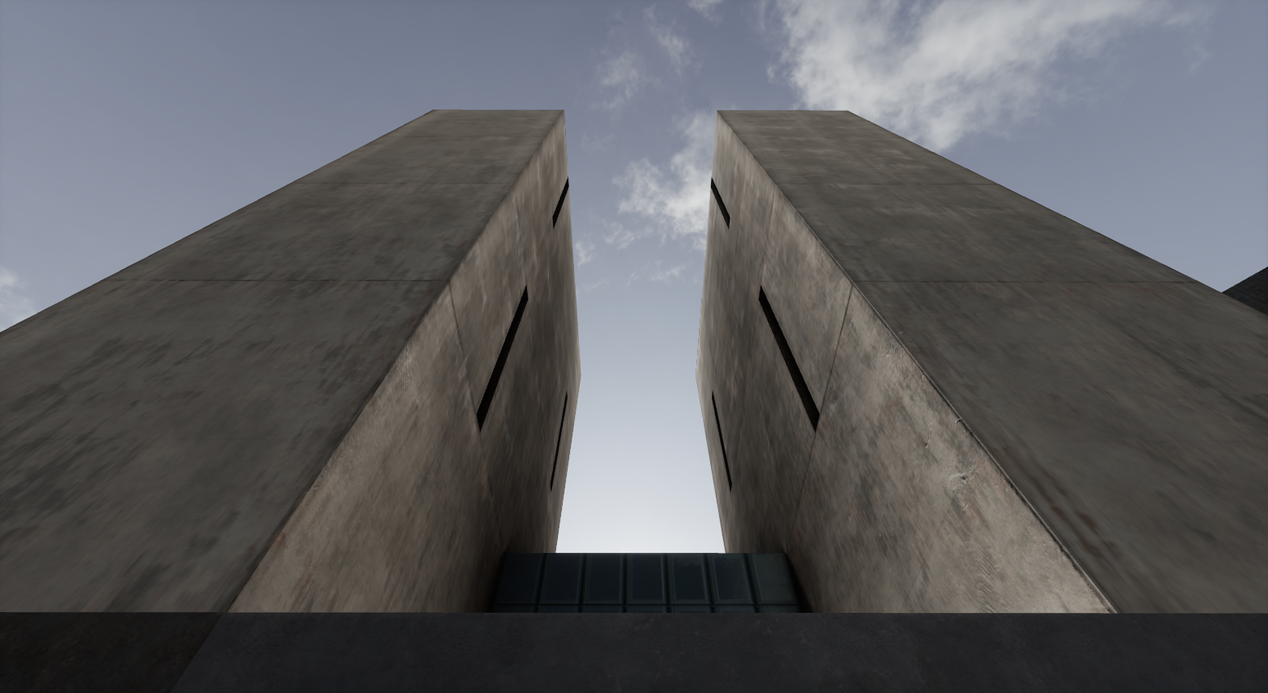
The playable space then needed to be bound by two primary structures on each side in accordance with the initial lore concept set out by our Art Director. Este is a small building nestled between two behemoth architectures of some futuristic metropolis: an office building on one side and a residence on the other. I took this initial concept and developed the full 3D architecture prototype and materiality. To give each side some identity and help the player locate themselves on the map, I decided to give the office and residence different visual languages. I envisioned the office as more mechanical and impending with the residence feeling more flowing and elevated. The office used rectilinear geometry with vertical emphasis and mechanical materials (mostly metal paneling) while the residence used smooth, curved geometry with horizontal emphasis and natural materials (mostly rough concrete and a reflecting pool).

Environment Design: Suna
My first task after joining AEXLab was to redesign half of the buildings on the competitive map Suna which were mostly placeholders. Suna’s lore concept dictated that it was a formerly abandoned space launch site that had recently been reactivated. Most of the map was already utilizing an industrial or operations aesthetic with supporting props, so I envisioned designing these new buildings as more of an administrative area for the launch site which could hopefully help orient players to their location in the level. During the aesthetic redesign, I had to be careful not to alter the playable space and combat angles. I developed these designs in June and July 2022 leading up to the Miami Vail Major Playoffs, so the level layout could not change at risk of affecting the competitive gameplay balance.
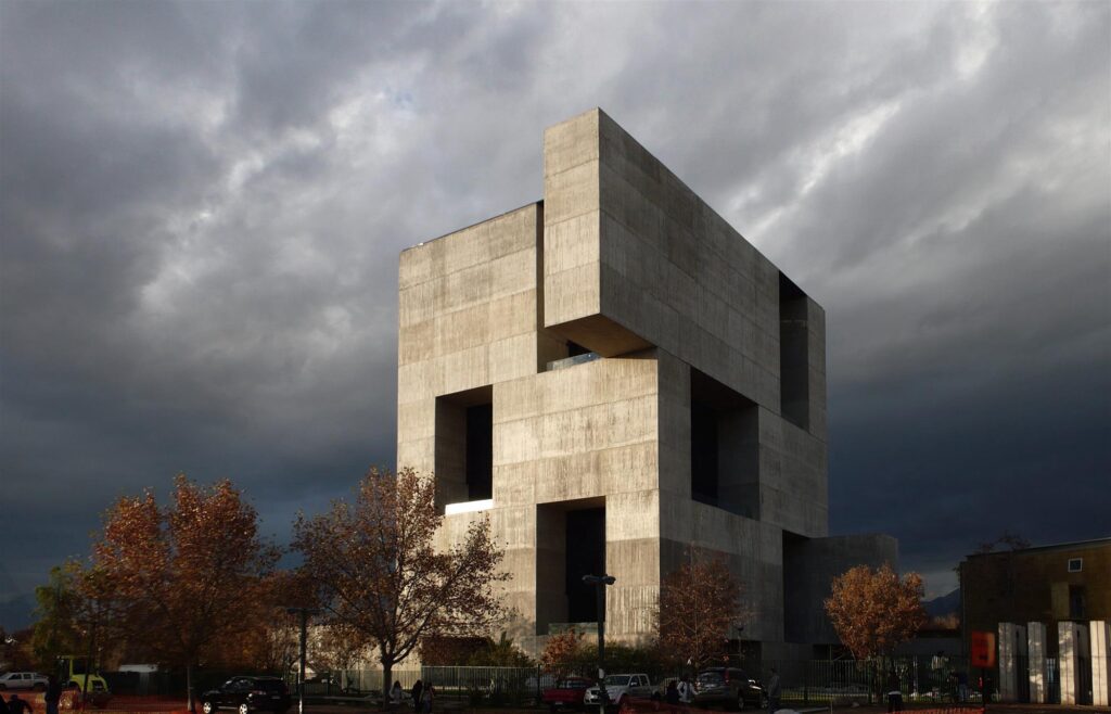
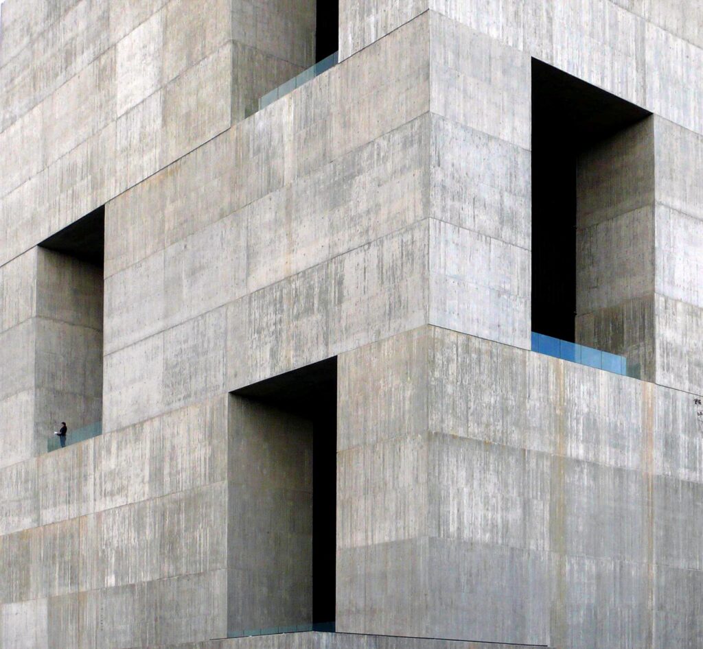
I was drawn to brutalist architecture as an aesthetic theme for the redesign. Not only did this style provide a minimal counterpoint to the highly detailed industrial feel of the level’s other half, but it also aligned with the Reyab faction’s aesthetic treatment within the Vail universe’s lore. Brutalist architecture here reads as both militarily dominant, but also technologically sophisticated. I used Elemental’s design of the Innovation Center UC as a strong reference.